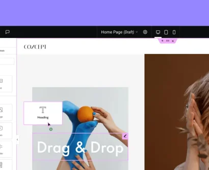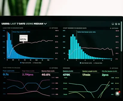
You spent a lot of time creating your website, carefully choosing the colors, and adding content, but there is still something that feels off. Despite your best efforts, your DIY website doesn’t really look as polished as the professional websites you admire. You are not the only one – this is one of the most common problems that business owners and entrepreneurs who go the DIY route face.
What’s the silver lining? The majority of poorly designed websites suffer from common website design mistakes. Once you learn what these mistakes are, it becomes much easier to transform your website from amateur-looking to professional.
The Real Cost of an Unprofessional Website
Before we look at solutions, it’s important to understand what’s at stake. Research shows that users form an opinion about your website in just 0.05 seconds after landing on it. A nonprofessional website design instantly hurts your credibility and makes conversions far less likely, as visitors can quickly choose a competitor’s site instead.
Your website is often the first contact point with a potential customer. If it looks like it was created by a beginner, visitors will subconsciously question your credibility, expertise, and attention to detail – qualities that directly influence their willingness to work with you.
8 Common Website Design Mistakes That Scream “Amateur”
1. Inconsistent Typography and Font Chaos
One of the most obvious signs of a DIY website is the use of too many fonts without a clear system. New website creators often get excited by the font options available and mix multiple typefaces for headings, body text, and buttons, which creates a chaotic and unprofessional look.
The Fix: Stick to two fonts maximum – one for headings and one for body text. Choose fonts that pair well together and use them consistently. Free resources like Google Fonts offer great options such as pairing Montserrat with Open Sans.
2. Poor Color Scheme Choices
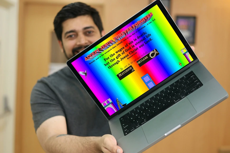
Amateur websites often feature clashing colors, overly bright palettes, or color combinations that reduce readability. A rainbow-like website might grab attention but rarely converts visitors into customers.
The Fix: Build a harmonious color palette with tools like Adobe Color or Coolors. Choose 2-3 primary colors with neutral tones, and ensure high contrast between text and background for readability. When in doubt, keep it simple.
3. Cluttered Layouts and Information Overload
DIY website builders tend to overload the homepage with every piece of content possible. The result is a confusing, cluttered layout with too much text, multiple calls-to-action (CTAs), and competing elements.
The Fix: Embrace white space. Focus each page on one main goal and remove unnecessary elements. Think of your website as a user experience (UX) journey, not a storefront window packed with everything at once.
4. Low-Quality or Inconsistent Images
Pixelated images, mismatched photo styles, or irrelevant stock photos instantly make a website look unprofessional. Many DIY websites grab the first free images they find without considering quality or branding consistency.
The Fix: Use high-quality, consistent imagery. Sites like Unsplash or Pexels offer professional free photos, but make sure they align with your brand style. Apply the same filters, tones, or styles across all visuals.
5. Generic Stock Photos and Fake Testimonials
Overused stock photos (especially those with staged, perfect-smile models) signal a generic, untrustworthy website. Similarly, “fake” testimonials with stock photo headshots destroy credibility.
The Fix: Choose natural, less stereotypical stock photos if you must use them. For testimonials, include real customer names and photos (with permission) or use authentic text-only reviews.
6. Poor Navigation and Confusing Menu Structure
Complicated menus, vague labels, or missing key pages frustrate visitors. Many DIY site owners create navigation that makes sense to them but confuses everyone else.
The Fix: Simplify your navigation. Keep menus to 5-7 items with clear, descriptive labels. Test your menu by asking someone unfamiliar with your business to find specific information quickly.
7. Mobile Responsiveness Issues
Most users browse websites on mobile devices, so if your site isn’t mobile-friendly, it looks unprofessional by default. Small fonts, overlapping sections, and non-working buttons are all signs of poor responsive design.
The Fix: Test your website across multiple devices and screen sizes. Use mobile editing tools in website builders or WordPress page builders like Elementor. Ensure buttons are large enough to tap and text remains readable.
8. Weak or Missing Calls-to-Action
Professional websites guide visitors with clear, persuasive calls-to-action. Many DIY websites either have no CTAs or weak ones, leaving visitors unsure of what to do next.
The Fix: Place strong, action-oriented CTAs on every page. Use visual contrast to make buttons stand out and guide users toward conversions.
Quick Wins for Immediate Improvement
- Update Your About Page: Make it authentic and relatable to build trust.
- Optimize Loading Speed: Compress images, remove unnecessary plugins, and choose reliable hosting.
- Add Social Proof: Showcase customer testimonials, reviews, case studies, or client logos.
- Professional Contact Information: Clearly display your phone number, email, and physical address.
- Consistent Branding: Keep your logo, colors, fonts, and messaging unified across all platforms.
The Learning Curve Challenge
Even though these fixes will instantly improve your site, applying them effectively requires knowledge of web design principles, UX, and technical skills. Many business owners reach a point where they want professional results but lack the design or development expertise to achieve them.
Structured learning, such as a comprehensive WordPress or Elementor training program, can help you progress faster than relying on scattered tutorials.
Moving Beyond Amateur Status
Creating a professional website isn’t just about following a checklist – it’s about understanding website design best practices, usability, and user expectations. With the right approach, your DIY website can look as professional as a custom-designed one.
The mistakes discussed above are not permanent. By learning the fundamentals of WordPress design, UX, and conversion optimization, you can transform your site while keeping professional standards intact.
Conclusion
Just because you built your website yourself doesn’t mean it has to look amateurish. By fixing common website design mistakes and applying professional principles, you can create a website that builds trust, reflects your brand’s quality, and turns visitors into customers.
Remember, every web design expert started as a beginner. The difference lies in learning systematically, mastering best practices, and using the right tools. With a strong foundation, your DIY website can stand alongside professionally designed sites – while saving development costs.
The key is to move beyond random fixes and adopt a clear strategy for professional web design and user experience that works both visually and functionally.


